
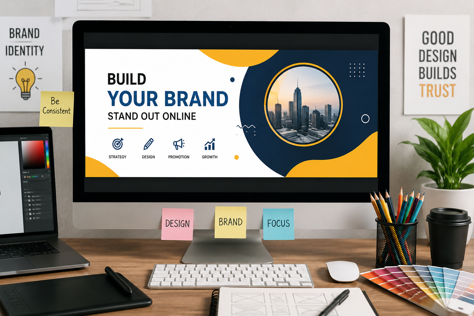
A banner can be one of the first things people notice when they visit your website, read a blog post, or come across your social media content. A well-designed banner can communicate an idea quickly, highlight an important message, and make your brand easier to recognize. However, making an useful banner is not simply about adding attractive colors and images. The design needs to have a clear purpose and make it easy for people to understand what you want them to do.
Whether you’re promoting a product, announcing an event, sharing an article, or building awareness, a useful banner should support the larger goal of your content. The strongest designs usually combine a clear message, readable typography, relevant imagery, and consistent branding.
Research and real-world examples also show that small changes to banner messaging and layout can have measurable effects. Adobe’s banner design guidance highlights examples where clearer messaging and stronger above-the-fold design contributed to significant improvements in clicks and conversions.
Start With a Clear Goal
Before opening a design tool, decide what your banner needs to accomplish.
Ask yourself:
- Do I want people to click?
- Should they learn about something?
- Am I promoting an offer?
- Do I want to announce an event?
- Is the goal simply to strengthen brand recognition?
A banner becomes much easier to design when there is one clear objective. Trying to communicate several different messages at once can make the visual confusing.
Keep the Main Message Short
Online audiences tend to scan rather than carefully read every visual they encounter. Your headline should communicate the main idea quickly.
Instead of writing a long paragraph, focus on a short headline supported by one brief detail when necessary.
For example:
Weak:
“Discover everything our company has to offer and learn more about our latest collection of products and services.”
Better:
“Explore Our New Collection”
The second version is easier to understand at a glance and leaves room for the visual elements to breathe.
Build a Strong Visual Hierarchy
Not every element on a banner should have the same level of importance.
Your headline should generally receive the most attention, followed by supporting information and then the call to action or brand details. Adobe recommends establishing this hierarchy before focusing heavily on decorative styling.
You can create hierarchy through:
- Font size
- Font weight
- Contrast
- Position
- Spacing
- Color
If everything is large, bold, and colorful, nothing feels important. Give each element a specific role.
Use Branding Consistently
A banner should look like it belongs to your business.
Choose a consistent combination of:
- Brand colors
- Heading fonts
- Body fonts
- Logo placement
- Image styles
- Button or CTA styles
Modern design tools can make this easier by allowing users to apply saved brand colors and fonts across designs. Adobe Express, for example, provides brand styles that can be applied across pages and designs.
Consistency doesn’t mean every banner has to look identical. Instead, recurring visual elements should make your content recognizable.
Choose Images That Support Your Message
A strong image can communicate an idea faster than several lines of text, but only when it is relevant.
If you’re promoting a travel service, use imagery that suggests the destination or experience. If you’re promoting software, consider screenshots, interfaces, or visuals related to the product.
Avoid choosing an image simply because it looks attractive. Ask whether it actually supports the message.
Make Your Banner Easy to Read
One of the most common banner problems is poor readability.
Text can become difficult to read when it is placed over a complicated image, uses weak color contrast, or is packed too closely together.
Try these simple fixes:
- Use sufficient contrast between text and background.
- Leave enough space around the headline.
- Avoid unnecessarily decorative fonts.
- Keep lines relatively short.
- Check the design at a smaller size.
Left-aligned text can also improve readability in many layouts because the eye has a predictable starting point for each line. Brand designer Liz Mosley has specifically highlighted alignment and spacing as important considerations for making visual content easier to consume.
Design for Different Platforms
A banner that looks perfect on a desktop monitor may not work well on a smartphone.
Before publishing, check how your design behaves when it is:
- Cropped
- Resized
- Compressed
- Viewed on a smaller screen
Keep important text, logos, and calls to action away from the edges so they don’t disappear when the design is cropped.
Adobe recommends running quick crop, compression, and mobile “glance” tests before publishing banners.
Use Templates to Build Faster
Templates provide a starting structure that can be customized with your own colors, images, copy, and branding. Once you find a layout that works, you can reuse its structure for future campaigns.
This is especially helpful for businesses that regularly publish blog posts, social media updates, promotions, or announcements.
Templates can also help maintain consistency across a campaign while reducing repetitive design work.
Test Before Publishing
Before you publish, take a few minutes to review the banner.
Try the two-second test: reduce the banner to a small size and look at it briefly. Can you immediately understand what it is about?
Then check:
- Is the headline obvious?
- Is the CTA easy to find?
- Does the image support the message?
- Is the branding recognizable?
- Does anything look crowded?
- Does the design still work on mobile?
If the answer to any of these questions is no, simplify the design rather than adding more elements.
Final Thoughts
A useful banner doesn’t need to be complicated. Its job is to communicate one clear idea, guide attention, and reinforce your brand.
Start with a specific goal, keep the message concise, create a strong visual hierarchy, use consistent brand elements, and test the final design across different placements. With a repeatable approach and the right templates, businesses can create banners that look professional while making their online presence more recognizable and effective.